Club Rebranding
Moderator: Zulus Thousand of em
-
mrkint
- Passionate

- Posts: 2681
- Joined: Tue Jan 08, 2013 12:21 am
- Location: On the hunt for Zat Knight's spinal cord
Re: Club Rebranding
A wee bit on the website blurb about the old crest
Hmm. Seems odd. Does Reebok hold sway over it, or sumfin, idk.The existing ribbon-style crest that was introduced following the move to the Reebok Stadium in 1997 will remain in place as the club’s stadium crest.
Re: Club Rebranding
To me it suggests 'We can't be arsed changing the big sign on the side of the stadium'mrkint wrote:A wee bit on the website blurb about the old crest
Hmm. Seems odd. Does Reebok hold sway over it, or sumfin, idk.The existing ribbon-style crest that was introduced following the move to the Reebok Stadium in 1997 will remain in place as the club’s stadium crest.
-
bobo the clown
- Immortal

- Posts: 19597
- Joined: Wed Mar 09, 2005 8:49 am
- Location: N Wales, but close enough to Chester I can pretend I'm in England
- Contact:
Re: Club Rebranding
Probably costs too much to take it down !!mrkint wrote:A wee bit on the website blurb about the old crest
Hmm. Seems odd. Does Reebok hold sway over it, or sumfin, idk.The existing ribbon-style crest that was introduced following the move to the Reebok Stadium in 1997 will remain in place as the club’s stadium crest.
I'm not looking forward to the QQ sign going up (though the 188 is shite enough itself). Maybe the ground will be renamed "The Cash-Point Stadium" ?
Not advocating mass-murder as an entirely positive experience, of course, but it had its moments.
"I understand you are a very good footballer" ... "I try".
"I understand you are a very good footballer" ... "I try".
-
si2008
- Hopeful

- Posts: 222
- Joined: Wed Dec 20, 2006 5:10 pm
- Location: at my pc except on match days when i,m watching the whites
Re: Club Rebranding
new badge..so surely the Reebok should have the new crest on not the one with the ribbons...again wanderers doing everything in half lol
-
r0ckpaperscissors
- Hopeful
- Posts: 47
- Joined: Sun May 13, 2012 11:16 pm
- Location: Bristol
- Contact:
Re: Club Rebranding
If that's the case then I hope they finally put cash points in the stadium. Sick of trudging to Asda just to get some cash for my half-time Bovril!bobo the clown wrote:Probably costs too much to take it down !!mrkint wrote:A wee bit on the website blurb about the old crest
Hmm. Seems odd. Does Reebok hold sway over it, or sumfin, idk.The existing ribbon-style crest that was introduced following the move to the Reebok Stadium in 1997 will remain in place as the club’s stadium crest.
I'm not looking forward to the QQ sign going up (though the 188 is shite enough itself). Maybe the ground will be renamed "The Cash-Point Stadium" ?
contrite contrarian
-
mrkint
- Passionate
- Posts: 2681
- Joined: Tue Jan 08, 2013 12:21 am
- Location: On the hunt for Zat Knight's spinal cord
Re: Club Rebranding
Great stuff! And they'll only charge you a rather reasonable 23149783454345% interest for you to access your own money.r0ckpaperscissors wrote:If that's the case then I hope they finally put cash points in the stadium. Sick of trudging to Asda just to get some cash for my half-time Bovril!bobo the clown wrote:Probably costs too much to take it down !!mrkint wrote:A wee bit on the website blurb about the old crest
Hmm. Seems odd. Does Reebok hold sway over it, or sumfin, idk.The existing ribbon-style crest that was introduced following the move to the Reebok Stadium in 1997 will remain in place as the club’s stadium crest.
I'm not looking forward to the QQ sign going up (though the 188 is shite enough itself). Maybe the ground will be renamed "The Cash-Point Stadium" ?
Re: Club Rebranding
The only one can't be protectedBL3 wrote:You've completely missed the point. It's a tweaked version of the badge we had in the mid-70's. Why not just use that one rather than spend money redrawing something that didn't actually need to be redrawn? The fact that you haven't even noticed that it's been redrawn, just sums up the sheer pointlessness of the whole 'rebranding' exercise.TKIZ! wrote:'Pointless rebrand'? Are you serious? The 'ribbon' badge has and will always look awful, this not only acknowledges our past but gives us a badge that doesn't look like a clowns sneezed on itBL3 wrote:If that's the new badge, it's a bit of a pointless 'rebrand'. Why not just revert to the previous one rather than trying to tweak it slightly?
Maybe this one can?
And I like the 1877
Sto ut Serviam

Re: Club Rebranding
The 1877 is O.K. It's the clumsy redraw on the BWFC roundel and the ribbon which is disappointing.CAPSLOCK wrote:The only one can't be protectedBL3 wrote:You've completely missed the point. It's a tweaked version of the badge we had in the mid-70's. Why not just use that one rather than spend money redrawing something that didn't actually need to be redrawn? The fact that you haven't even noticed that it's been redrawn, just sums up the sheer pointlessness of the whole 'rebranding' exercise.TKIZ! wrote:'Pointless rebrand'? Are you serious? The 'ribbon' badge has and will always look awful, this not only acknowledges our past but gives us a badge that doesn't look like a clowns sneezed on itBL3 wrote:If that's the new badge, it's a bit of a pointless 'rebrand'. Why not just revert to the previous one rather than trying to tweak it slightly?
Maybe this one can?
And I like the 1877
-
americantrotter
- Passionate
- Posts: 2233
- Joined: Sat Jul 16, 2005 12:03 am
- Location: Portland, Maine USA
Re: Club Rebranding
Well I really like it. It's about time we had a proper badge.
Re: Club Rebranding
It does look like a fairly ameteurish attempt to me.
-
Armchair Wanderer
- Dedicated

- Posts: 1922
- Joined: Sun Aug 15, 2010 12:36 am
Re: Club Rebranding
Bit of the old with a modern twist! I like it!
The players you fail to sign never lose you any money.
Re: Club Rebranding
There's one at Bolton Arena if that's closer for you!r0ckpaperscissors wrote:If that's the case then I hope they finally put cash points in the stadium. Sick of trudging to Asda just to get some cash for my half-time Bovril!bobo the clown wrote:Probably costs too much to take it down !!mrkint wrote:A wee bit on the website blurb about the old crest
Hmm. Seems odd. Does Reebok hold sway over it, or sumfin, idk.The existing ribbon-style crest that was introduced following the move to the Reebok Stadium in 1997 will remain in place as the club’s stadium crest.
I'm not looking forward to the QQ sign going up (though the 188 is shite enough itself). Maybe the ground will be renamed "The Cash-Point Stadium" ?
I much prefer this badge, they should be changing the one on the stadium too though.
Re: Club Rebranding
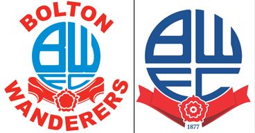
side-by-side for easy comparison..
if I tried hard to care that much..
1) the old one does look dated - naturally... simply to go back to that (I think) would be a mistake. For one thing - the name curled around top and bottom Bolton Wanderers does look a bit Microsoft WordArt to my eyes...
2) the new one - maybe a ribbon/banner with softer curves rather then the starched and ironed hard-folds would be softer on the eye - also, they have re-proportioned the lettering in the BWFC roundel - giving proportionately more space to the FC then the old logo did... which looks odd to me as I practiced as a boy drawing that and getting the proportions right - and I never found it easy! schoolbooks were covered in aborted and crappy-looking reproductions!
overall - nowt outrageous about the new badge - clean lines - simple - it'll do...
Re: Club Rebranding
The old badge didn't have the words 'Bolton Wanderers' on it and the rose was far more detailed than it appears on the version you've posted. It looked like this:

-
bobo the clown
- Immortal
- Posts: 19597
- Joined: Wed Mar 09, 2005 8:49 am
- Location: N Wales, but close enough to Chester I can pretend I'm in England
- Contact:
Re: Club Rebranding
The shorts, apparently ...

Not advocating mass-murder as an entirely positive experience, of course, but it had its moments.
"I understand you are a very good footballer" ... "I try".
"I understand you are a very good footballer" ... "I try".
-
bobo the clown
- Immortal
- Posts: 19597
- Joined: Wed Mar 09, 2005 8:49 am
- Location: N Wales, but close enough to Chester I can pretend I'm in England
- Contact:
Re: Club Rebranding
Yeah .... but that also had Frank Worthington, Willie Morgan, Paul Jones and Roy Greaves in it, amongst others.BL3 wrote:The old badge didn't have the words 'Bolton Wanderers' on it and the rose was far more detailed than it appears on the version you've posted. It looked like this:
Not advocating mass-murder as an entirely positive experience, of course, but it had its moments.
"I understand you are a very good footballer" ... "I try".
"I understand you are a very good footballer" ... "I try".

-
Dave Sutton's barnet

- Immortal
- Posts: 28594
- Joined: Sun May 14, 2006 4:00 pm
- Location: Hanging on in quiet desperation
- Contact:
Re: Club Rebranding
BL3 is right that the 70s badge is different to the one Bish posted - from memory, those curved words appeared around 1995 (so ClipArt era, but also first top-flight return).
Bish is right that the old proportions look better - more BW than FC.
I strongly suspect that Caps is right about copyright protection - it's one of the reasons Arsenal changed their badge about five years ago, with the gun going the other way. Folks were upset, especially those with tattoos.
Bish is right that the old proportions look better - more BW than FC.
I strongly suspect that Caps is right about copyright protection - it's one of the reasons Arsenal changed their badge about five years ago, with the gun going the other way. Folks were upset, especially those with tattoos.
-
Turkish Trotter
- Dedicated
- Posts: 1861
- Joined: Sun May 08, 2011 9:32 pm
Re: Club Rebranding
What ? Still no elephants !!!!!!!!!!!
Born to be a Wanderer!!
Some say Wisdom comes with age, I may be the exception !!
Some say Wisdom comes with age, I may be the exception !!
Who is online
Users browsing this forum: Bing [Bot], Google [Bot] and 85 guests